My day job requires me to deal more with non-technical stuff and it is pretty interesting to see the change that is currently happening with the introduction of AI. So I decided to play around with some vibe coding and well the desire to also take vertex synapse for a spin.
I was mostly curious about how easy it could be to maintain an API for insights into the supply chain of a government. This is by no means complete, but it allowed me the chance to further experiment with vibe coding as well as the hypergraph solution from Vertex.
This blog is mainly about how easy it is nowadays to go from idea to proof-of-concept.
You might be wondering why I chose the government, well mostly cause they are IMHO more transparent with their data and insights. This is also one of those ideas that could be managed and maintained by the national entity for cybersecurity. Would be pretty cool if all kind of entities in a country would be incentivised to provide data and receive the opportunity to query their supply chain risk. This could also be used by threat actors, but they can do that now anyhow.
The idea is pretty simple, can we create a graph of how companies interact with each other in terms of being subsidiaries, vendors etc. Can we then add software to it, to understand which software is being shared amongst companies? The more detail that we add to this graph the more accurate you’d be able to determine the impact of a supply chain attack on an organisational level.
Vibe coding made it very easy to create a proof-of-concept, mind you this is not production worthy. Then again that wasn’t the goal since I mainly wanted to validate if the idea would provide insights.
You can find the code for this experiment here. I’ve also attempted to create an AI friendly start here if you want to make it yourself fully from scratch.
The overall web application looks like this:
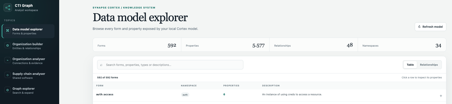
The web application offers exploring the Vertex Data Model as well as manually entering organisational data and then analysing that data. The loading of the data happens with external scripts. For now I’ve only inserted a limited data set:
That’s the nice thing about government transparency, you can investigate stuff and well help them out if you so desire. Based on that overview of websites you can then:
- Resolve all the domains to IPs
- Understand the relationship between the different government entities
- Analyse the websites for software used
This does not fully cover the supply chain risk, if you want to improve the data set you can use the new government code environment:
Go through all repositories link them to the right government entities and update the software used. Bonus, if they have generated SBOMs you can improve the accuracy of your data set and thus your analysis.
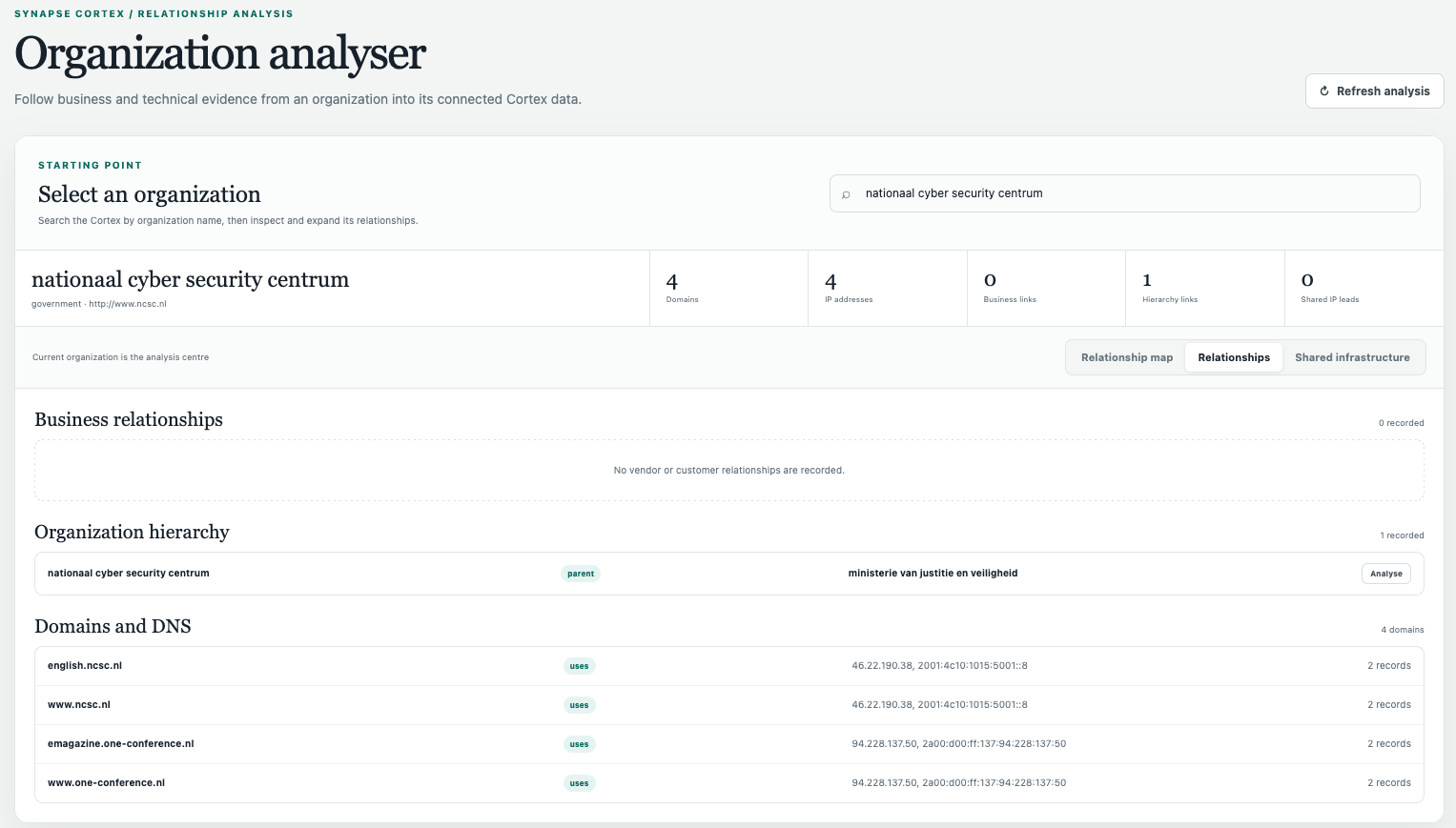
Since the Dutch NCSC is pretty awesome, I’m gonna use them as an example in this vibe coded application and some analysis snippets. Let’s start the organisation view:

This image provides us with a small overview of domains, parent organisation etc.
Sometime a table is just clearer, even though I am a big fan of graphs. We can also quickly view the software used by the NCSC, how many other organisations also use it?
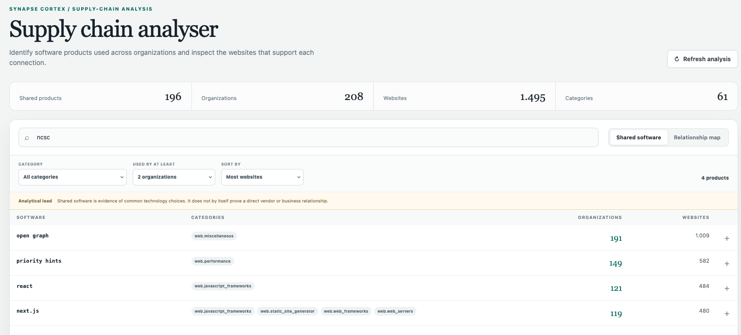
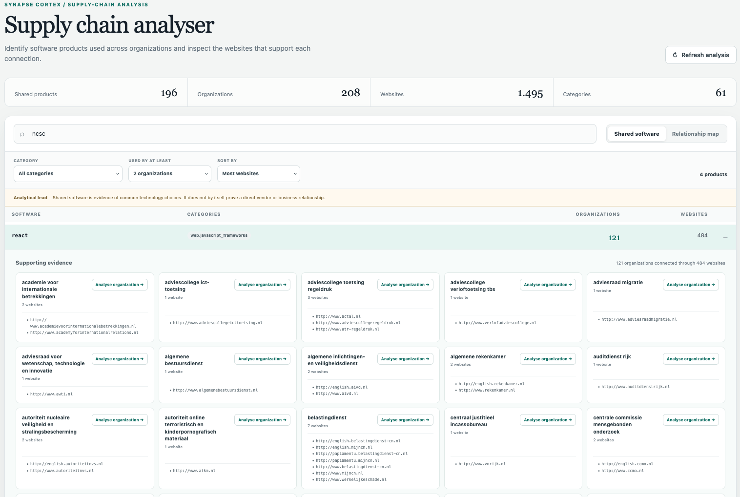
Nothing scary, but does provide interesting insights, we can zoom in on the specific URLs and organisations that for example use react:
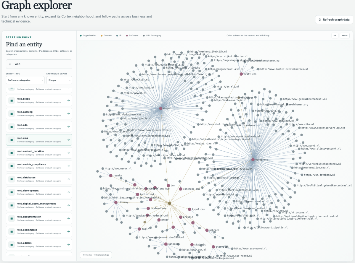
The graph based exploration is of course a must have :p

Lastly, let’s say we want to hack some CMS system and understand what our impact would be, this would be an interesting view to look further into:


