
Sometimes you are asked to perform a firewall analysis to determine if the configuration can be improved upon to reduce the ability for an attacker to move laterally through the network or identify attack paths that have been missed due to the many firewall changes.
You can perform this analysis using many tools and approaches, ranging from manually reviewing every rule, to using an automated tool like nipper or my personal favourite using a graph based approach (also works for log data). The reference section of this post contains papers that go in-depth on this approach.
With the graph based approach you can visualize the ruleset to identify nodes that have a lot of incoming and/or outgoing connections, but you can also trace paths through the network to understand if they should be removed. When combined with bloodhound data and neo4j you can query the data and have the graph database answer questions like “Is there a path from the workstation to the finance server?”. This requires some fair amount of knowledge, as well as supporting software to get it all setup, which in turn complicates the transfer of knowledge to network engineer or firewall administrators to be able to perform these analysis themselves, for the sake of better understanding if their changes impacted the security of the network.
Bottom line for me with these type of analysis is: How can I transfer security knowledge in an easy and understandable manner, to the people that have to deal with maintaining the environment on a daily basis?
For this reason I started to look around for alternatives and found a nice little utility that, in my honest opinion, fills the gap between portability, easy of use and still sufficiently powerful to perform some analysis work. My main requirements were:
- Able to be easily installed
- Able to be used without programming skills
- Able to visualize a graph
- Able to answer basic questions like: Which nodes connect to this node?
Searching around I found yEd (simple installers available for all major operating systems) which has the added bonus that it can directly ingest Excel files. Just in case you are not familiar with the corporate world, when you request an export of the firewall rules, unless you provide very specific instructions, people tend to provide excel files with the rules, objects and so forth. So if one of our objectives is to enable those same people to be able to perform their own analysis, being able to natively ingest Excel is a big bonus!
Hands-on example
All we need is to convert the received Excel file into an Excel file with three columns, since I don’t run any complex firewall setup, I generated some random data, just to illustrate how it works.:

- source
- destination
- port or protocol
For our analysis we just focus on “Accept” rules and ignore all other rules. This type of data transformation can be done within Excel, thus lowering the bar for most people to perform their own analysis.
When we first open yEd we select the “open” option to import our Excel file.

You can see that on the right side it displays the Excel content and if the Excel workbook has multiple sheets, you will be able to change the sheet. You can also have the original Excel file and just select the columns that you need, but I find it more convenient to have a separate sheet with just the src,dst & port data.
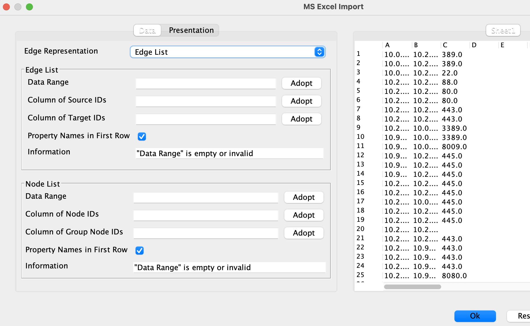
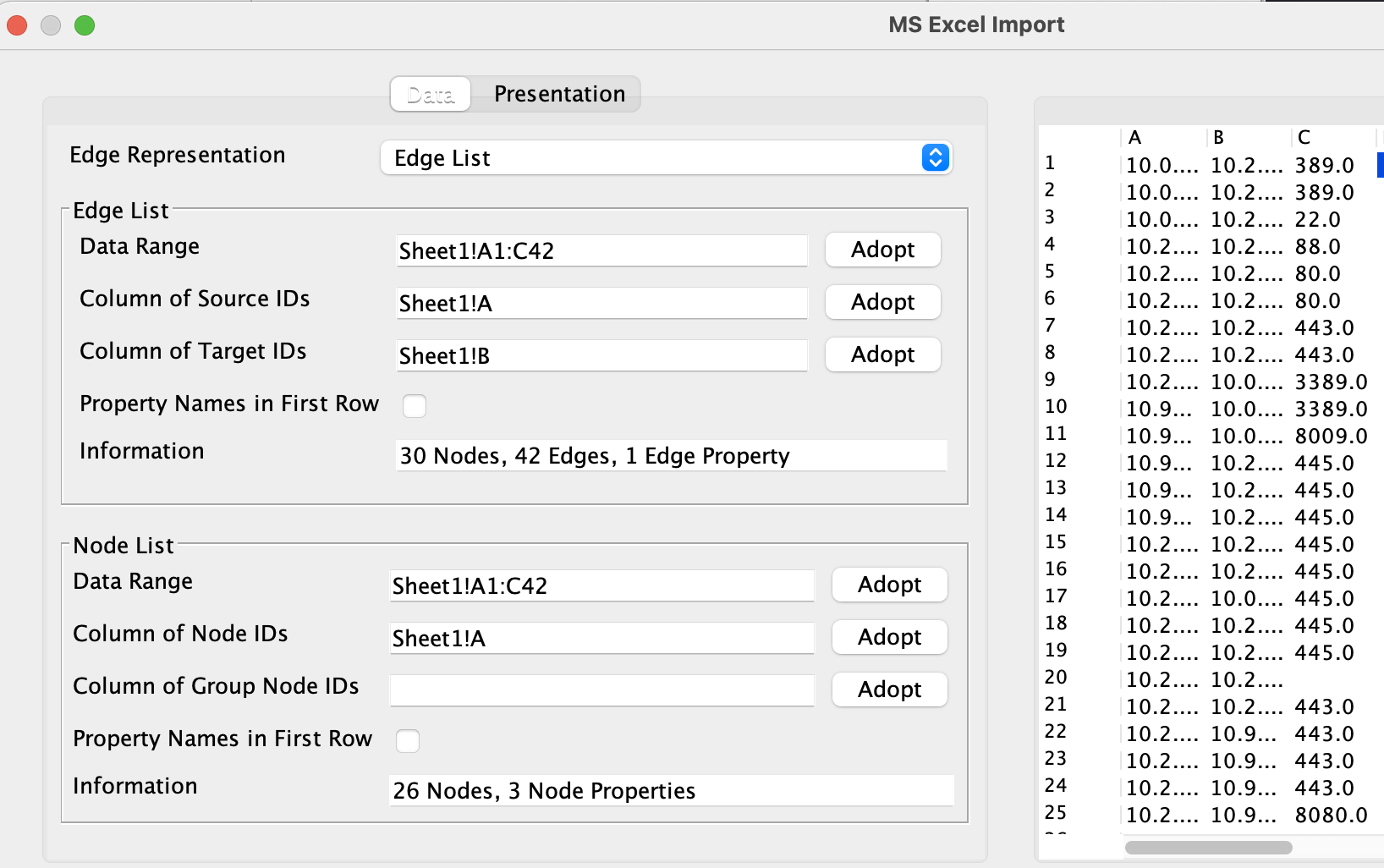
The settings for the “Edge list” below used all the columns for the “Data range” then you select which column you prefer for src/dst nodes. The settings for the “Nodes list” also used all the columns for the “Data range” and then the first column for the “Label Text”.
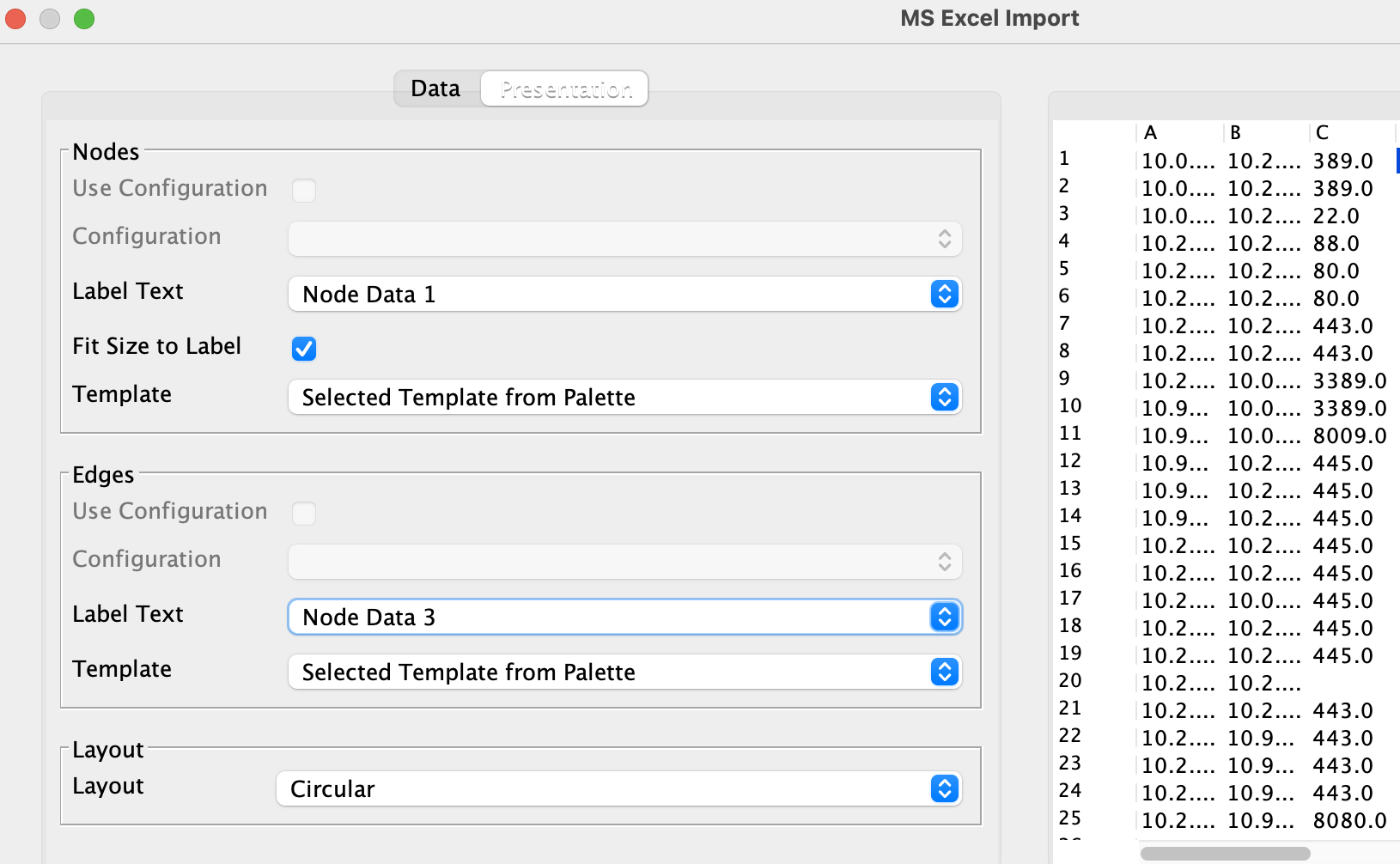
In the presentation tab we select the first colum for the labels of the nodes & the third column for the edges.
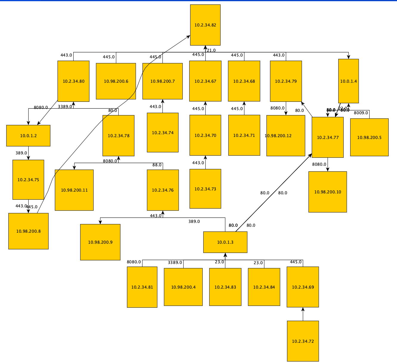
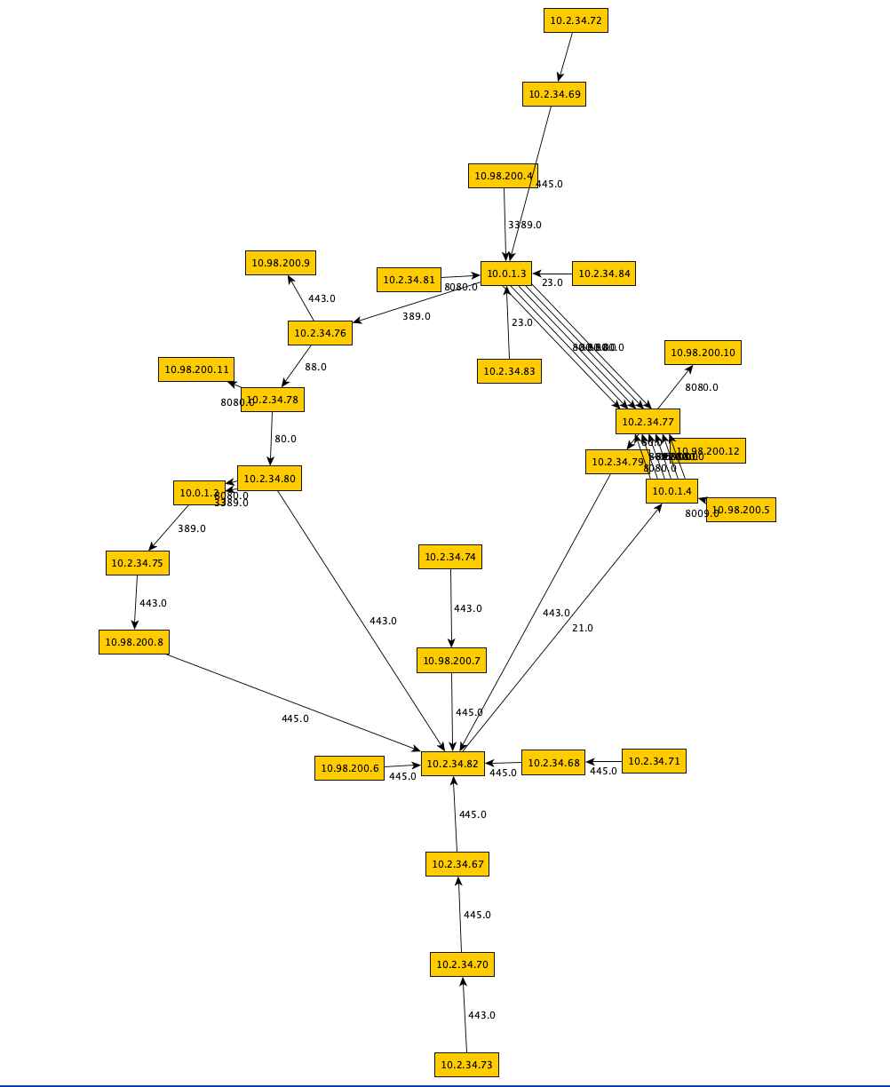
If everything went according to plan, we should now have a visual overview of our firewall rules.
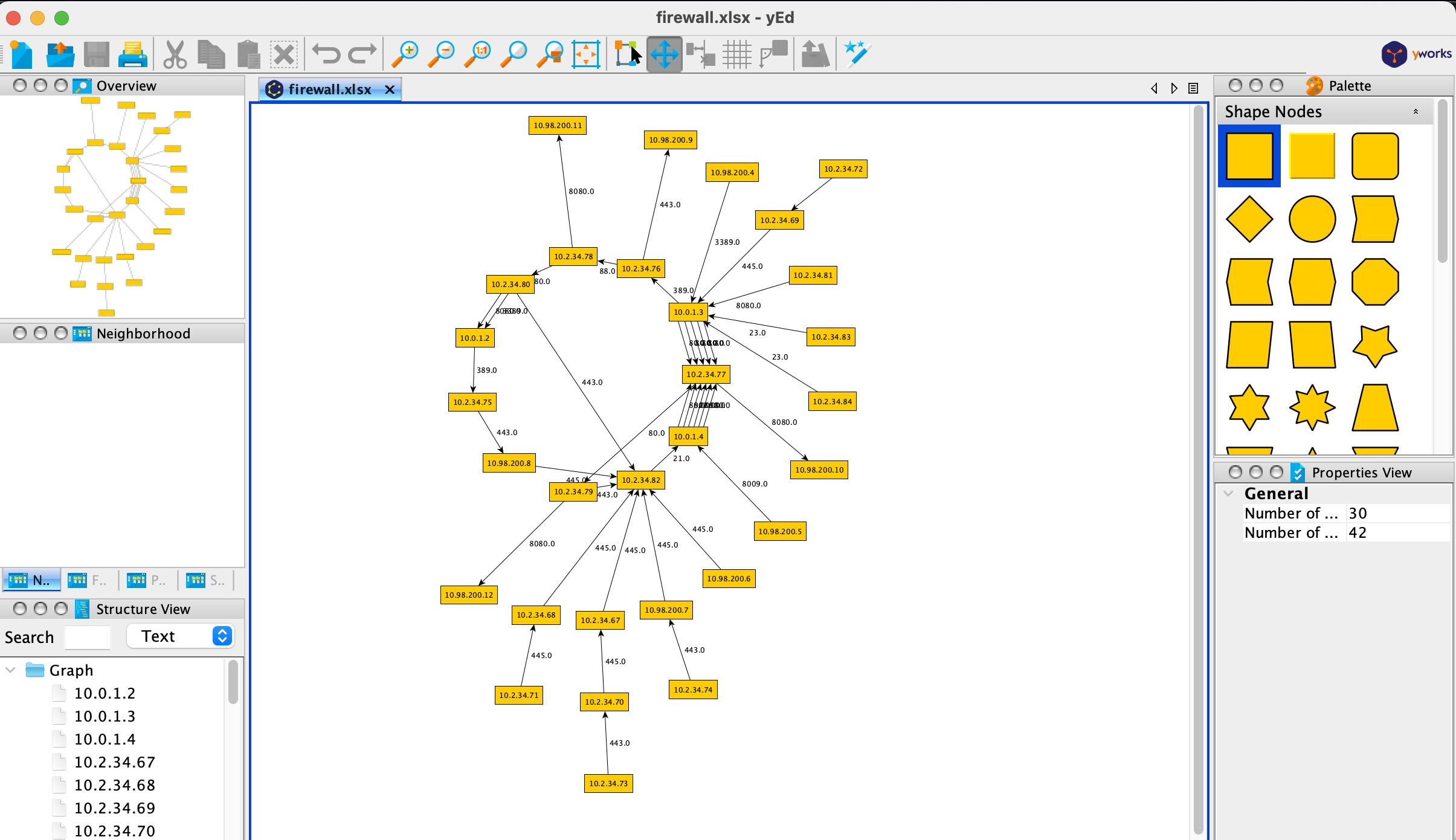
Since this is a small dataset, just to illustrate the concept it is fairly easy to navigate the graph. Now with yEd we sacrifice the ability to query or retrieve a full path from node A to node X, but it still retains sufficient functionality to be useful. For example when you click a node it shows the immediate neighbours:

Which you can of course pop-out to a bigger view:
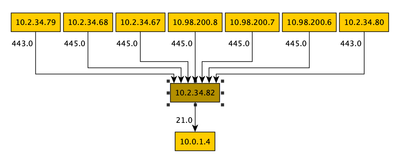
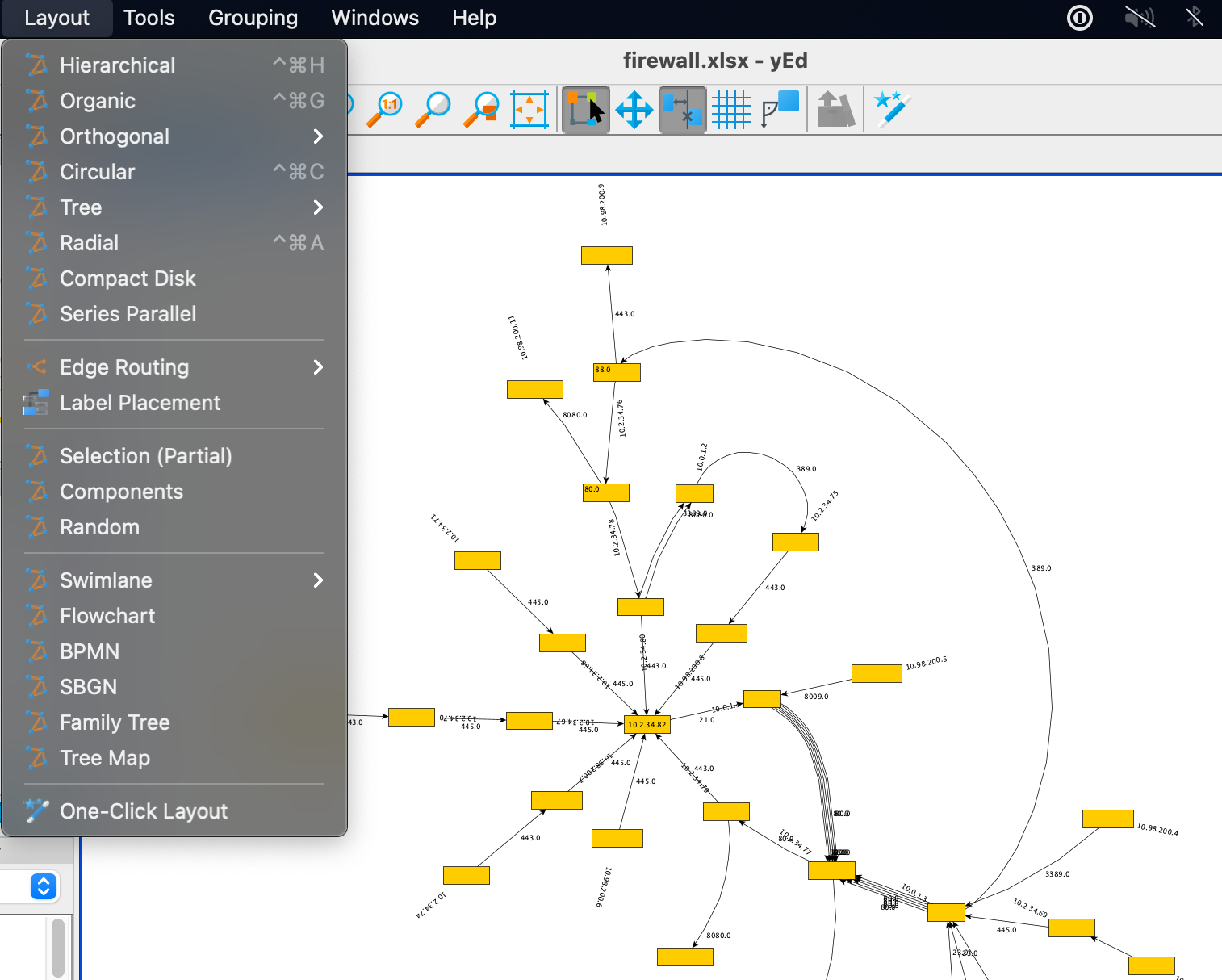
This makes it nice & easy to understand the flow to and from a node and understand which immediate neighbour nodes are involved. It also has a ton of layout options to help you navigate more complex graphs, some examples:

References
- https://www.cs.princeton.edu/courses/archive/fall10/cos561/papers/FireMan06.pdf
- https://www.giac.org/paper/gcia/1651/visualizing-firewall-log-data-detect-security/109883
- https://research.nccgroup.com/2013/04/04/visualising-firewall-rulesets-simplifying-firewall-administration-and-spotting-the-pivot-point/
- https://www.yworks.com/products/yed

2 thoughts on “Firewall analysis: A portable graph based approach”